Table of Contents
- Introduction to Typesetting
- What is Typesetting?
- Understanding Fonts in Typesetting
- Mastering Layouts in Typesetting
- Navigating Formatting in Typesetting
- Why is Typesetting Important?
- Practical Applications of Typesetting
- Conclusion
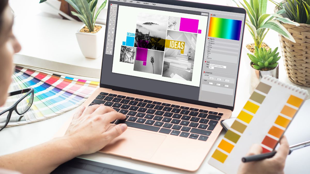
Introduction to Typesetting
Typesetting is a crucial process in publishing. It plays an important role in creating the first impression and facilitating a great reading experience. Without good typesetting, the readability and aesthetic appeal of a printed or digital document can be greatly compromised.
Typesetting involves arranging text and images on a page to make the content clear, engaging, and easy to follow. This process includes selecting appropriate fonts, determining the layout of elements on the page, and applying suitable formatting techniques.
Good typesetting ensures that the design complements the content, enhancing the reader’s experience and facilitating better comprehension of the information presented.
In today’s digital world, typesetting is critical in web design, desktop publishing, marketing materials, books, newspapers, and more. Even this writing relies on tactful typesetting to communicate ideas effectively.

In this introductory section, we’ll briefly touch on some of the key aspects of typesetting we’ll cover throughout the post:
- What is typesetting, and why does it matter?
- Understanding fonts and how to use them
- Layout principles and strategies
- Formatting techniques to polish your work
- Real-world applications of typesetting
By the end of the post, you’ll have a solid grasp of typesetting fundamentals. You can make more informed decisions for any document you create, whether a printed report, website, poster, or more.
So, let’s dive in and demystify the art and science behind effective typesetting.
What is Typesetting?
Typesetting refers to arranging text and images on a page for printing or digital display. It encompasses tasks like choosing fonts, determining line lengths, adjusting the spacing between letters and words, and designing the overall layout of a document.
The origins of typesetting can be traced back to the invention of movable type and the printing press in the 15th century, spearheaded by Johannes Gutenberg‘s invention. Before this, books and documents had to be handwritten and copied, which was extremely laborious and time-consuming.
The advent of the movable type allowed for much faster text composition. Individual letters and punctuation marks were cast on metal blocks which could be arranged and rearranged to form words, sentences and paragraphs.
Over the centuries, typesetting evolved from a manual process to a mechanized one. The late 19th century saw the introduction of hot metal typesetting, which involved casting lines of type as a single block.
In the 20th century, phototypesetting became popular, where text was projected onto photo-sensitive paper or film. The digital revolution of the 1980s completely transformed typesetting, with desktop publishing software allowing almost anyone to do typesetting on personal computers.
Today, typesetting plays a key role in various industries:
- In publishing, typesetting is used to layout book interiors, magazines, newspapers and other publications.
- In marketing and advertising, typesetting is critical for brochures, posters, packaging, branding and more.
- Web designers rely on typesetting to create visually appealing and easy-to-read websites.
- Graphic designers use typesetting to develop informational graphics, invitations, business cards and visual communication materials.
No matter the medium, typesetting is essential for organizing and presenting textual and visual information to enhance readability, navigation and aesthetics for the end user.
Understanding Fonts in Typesetting
Fonts play a critical role in typesetting. They influence the overall look, feel, and readability of a document. Choosing the right fonts can enhance engagement, while the wrong fonts can detract and tire the reader.
The Importance of Fonts
Fonts set the tone and personality of a document. Serif fonts like Times New Roman promote a traditional, newspaper-like feel. Sans-serif fonts like Arial have a more modern, minimalist style. Script and decorative fonts are best for titles and headers. The right font helps orient readers and sets expectations.
Fonts also affect readability. Simple, familiar fonts are easiest to read in long blocks of text. Fonts with wide characters and good spacing improve readability. On the other hand, fancy script fonts or exceptionally thin fonts can strain the eyes.
Types of Fonts
There are thousands of fonts, but they fall into a few main categories:
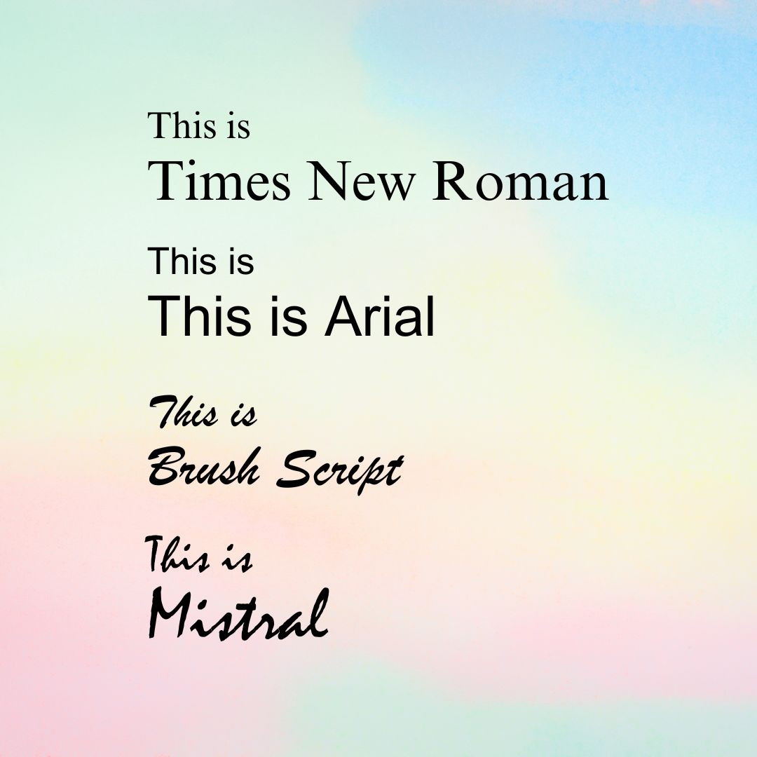
- Serif – Has small lines on letters. Example: Times New Roman. Typically used in books, newspapers, magazines, and essays.
- Sans-serif – No small lines. Example: Arial. Typically used in websites, apps, posters, and headings.
- Script – Mimics handwriting. Example: Brush Script. Typically used in wedding invitations, branding, and logos.
- Decorative – Creative, stylized letters. Example: Mistral. Typically used in Flyers, cards, and infographics.
Serif fonts are commonly used for long passages of text. Sans-serif fonts work well for headings and on the web. Script and decorative fonts are popular for titles and logos.
Pairing the right fonts helps create a visual hierarchy. Serif body text with sans-serif headers is a popular combination. Using a variety of fonts with different styles also adds visual interest.
With an understanding of fonts and their impact, typesetters can choose and combine fonts effectively for any project.
Mastering Layouts in Typesetting
Layouts are crucial in typesetting by determining how text and visual elements are arranged on a page or screen. The layout directly impacts the aesthetics, readability, and accessibility of a document. Some key principles of effective layouts in typesetting include:
Establishing Hierarchy
Hierarchy creates a visual distinction between headings, subheadings, body text, and captions. Strategic use of fonts, sizes, colors, and positioning guides readers through the content. For example, a heading in a large bold font at the top signals the start of a new section.
Balancing Elements
The placement and proportions of text, images, white space, margins etc., should be balanced. Aligning elements and using grid systems create organized, pleasing layouts. Asymmetric or random layouts may look cluttered and overwhelm readers.
Optimizing Readability
Readable typography, line spacing, alignment, contrast, and flow optimize ease of reading. Avoid dense blocks of text cramped into a single page. Short paragraphs with ample white space improve readability. Left-aligned text is easiest to read, while centered text works for headlines.
Guiding the Eye
Visual cues like arrows, borders, color coding, and intentional white space direct attention and make content scannable. For example, pull quotes draw readers into important passages. Icons can guide navigation through content.
Consistency and Alignment
Consistent positioning of elements like page numbers, headers, and captions allows readers to navigate layouts intuitively. The alignment of items into columns or along an invisible axis creates cohesion. Consistent styling also builds unity in multi-page documents.
By mastering these key principles, typesetters create polished, professional layouts that effectively communicate information while captivating readers.
Navigating Formatting in Typesetting
Formatting plays a critical role in enhancing the final product in typesetting. Proper formatting improves readability, creates visual hierarchy, and contributes to the overall aesthetic appeal of a document. In this section, we’ll examine some key formatting techniques and tips for effective use in typesetting.
Using White Space
White space refers to the empty areas on a page devoid of text or graphics. Appropriate white space between paragraphs, sections, images, and other elements can improve readability. White space makes the content less dense and easier on the eyes. Some tips for using white space effectively include:
- Add extra line spacing between paragraphs.
- Use wider margins on the page.
- Insert page breaks between sections.
- Add padding around images and other visuals.
Emphasizing Text
Applying formatting to emphasize important text is a great way to create a visual hierarchy. Bold, italic, underlined, colored, or highlighted text stands out and grabs readers’ attention. But use emphasis sparingly, only for keywords and phrases. Overusing it reduces its impact. Some formatting options to emphasize text include:
- Bold – Makes text darker and thicker.
- Italics – Slants text to the right.
- Underline – Draws a line below.
- Color – Such as red for warnings.
- Highlight – Adds background color.
Using Lists Effectively
Lists are a great way to break up long chunks of text and draw attention to important points. Unordered lists with bullet points suit quick skimming, while numbered lists imply sequence or rankings. Some tips for the effective use of lists include:
- Introduce each list with a lead-in sentence.
- Use consistent punctuation after each point.
- Capitalize the first letter of each point.
- Align each point directly below the others.
With the right formatting techniques, you can transform dull blocks of text into engaging content. Remember to use them strategically and sparingly to maximize their impact.
Why is Typesetting Important?
Good typesetting is crucial for engaging readers and helping them easily comprehend written material. Carefully chosen fonts, well-structured layouts, and effective formatting make the text more inviting and readable. This improves the overall user experience and information retention.
Fonts with high legibility allow readers to process letters and words smoothly without distraction. Layouts with ample white space, clear headings, and optimal line length reduce eye strain. Good formatting, like bullet points and text hierarchy, helps reinforce key messages. Together, these typesetting elements enhance comprehension and keep readers focused.
Additionally, deliberate typesetting choices contribute greatly to brand identity and communication goals. Fonts, colors, and text styling create visual continuity across marketing materials. This strengthens brand recognition and personality. Strategic layouts emphasize important messaging in brochures, ads, websites, and more to drive engagement.
In essence, skillful typesetting ensures that written content is presented in the best possible format. This amplifies its impact and effectiveness for informing, educating, entertaining and persuading readers.
Practical Applications of Typesetting
Now that we’ve covered the fundamentals of typesetting let’s look at some real-world examples of how these principles are applied.
Book Publishing
In book publishing, typesetting is crucial for formatting the text and layouts in a readable way. Font, line spacing, margins, and indentation can greatly impact the reading experience. Publishers work closely with typesetters to design appealing book interiors. For example, fiction novels often use more creative and expressive typesetting than nonfiction books.
Magazine Publishing
Magazine publishers rely heavily on typesetting to differentiate sections, establish a hierarchy, and guide readers through complex layouts. For magazines with a strong visual brand, typography and typesetting directly support the overarching aesthetic. Typesetters must balance readability with artistic expression. For example, magazine covers showcase bold, eye-catching typesetting.
Journal Publishing
In academic journal publishing—an important element of academic publishing—typesetting ensures clarity, readability, and professionalism. It aids in organizing complex information such as research data, figures, tables, and references into a coherent and accessible format. Proper typesetting is crucial to maintain high standards of academic presentation, facilitate peer review, and support effective dissemination of scholarly knowledge.
Marketing Collateral
In brochures, flyers, posters, etc., typesetting helps deliver a brand’s messaging in a visually striking yet easy to comprehend way. Marketers work with designers and typesetters to highlight important information and create organized, scannable layouts based on typesetting best practices. Consistent typesetting across campaigns also strengthens brand recognition.
Tips for Beginners
Here are some tips to help beginners navigate typesetting:
- Learn the basic principles of typography, like font pairings, hierarchy, alignment, etc.
- Study typesetting examples from publications you admire to understand effective techniques.
- Invest in high-quality fonts designed for enhanced readability.
- Use grid systems and columns to organize information.
- White space is your friend – don’t overcrowd the page.
- Choose font sizes, line heights, etc., appropriate for your medium.
- Be consistent with formatting elements like bullet points and text styling.
- Ask for feedback from professional designers whenever possible.
With practice and an eye for design, anyone can become competent at typesetting. Mastering the nuances takes time, but the payoff is worth the effort.
Conclusion
We have covered a lot of ground in this write-up on typesetting. From understanding the basics of typesetting to exploring fonts, layouts, and formatting, this post aims to introduce this crucial aspect of design comprehensively.
The key takeaways from this write-up are:
- Typesetting is the process of arranging text and images for printing or display.
- Font choice, layout principles, and formatting techniques all significantly impact the aesthetics and readability of a document.
- Good typesetting practices enhance reader comprehension and engagement.
- Typesetting is vital in the publishing, marketing, and branding industries.
Now, you should start paying closer attention to typesetting whenever you come across printed or digital media. Notice how different fonts, layouts, and formatting choices create certain impressions and influence your experience as a reader.
Try experimenting with typesetting basics in your projects – reports, presentations, posters, or social media graphics. A few small tweaks can go a long way in improving aesthetics and effectiveness. Use this post as a reference whenever you need guidance or inspiration.
Most importantly, remember that typesetting should always serve your core objective and enhance communication with your target audience. Mastering the fundamentals will allow you to use typesetting strategically to deliver your message and tell your story. With consistent practice, you will understand how to wield the power of fonts, layouts, and formatting.
5 thoughts on “What is Typesetting: Mastering Layouts and Formatting”