
Table of Contents
- Introduction
- 1. Gathering Inspiration for Your Book Cover
- 2. Understanding the Essence of Your Book
- 3. Visual Hierarchy and De-cluttering
- 4. Selecting the Right Fonts and Colors
- 5. Considering the Back Cover and Spine
- 6. Case Studies of Effective Book Cover Designs
- Conclusion
Introduction
Designing a book cover is an integral part of the book publishing workflow. The book cover is critical in capturing readers’ attention and conveying what a book is about.
This article covers key considerations you need to take when designing a book cover (either on your own or through a professional designer). We will also look at real-life examples of book covers that effectively convey the message of the books.
An effective cover intrigues browsers, helps them determine if the book aligns with their interests, and motivates them to pick it up and read the description. In this way, the cover is the face of the book and acts as a sales tool to entice readers.
Knowing trends and conventions within your genre is important when designing a book cover. For example, romance novels feature photographic covers with romantic imagery, while fantasy books often have illustrated covers with symbolic elements.
Following genre norms signals to readers what kind of book it is and helps attract the target audience. However, balancing creativity with conformity is key.
Some key elements of an effective book cover design include:
- A strong, legible title and author name that quickly communicate the book’s subject.
- Compelling imagery that reflects the book’s themes.
- A clean, uncluttered layout that highlights the key elements.
- A style that aligns with the book’s genre.
- A design that stands out on small thumbnails online.
An eye-catching and appropriate cover can make a big difference in whether a book gets noticed or passed over. Careful consideration of all the elements involved in cover design is essential for selling your book to readers.
1. Gathering Inspiration for Your Book Cover
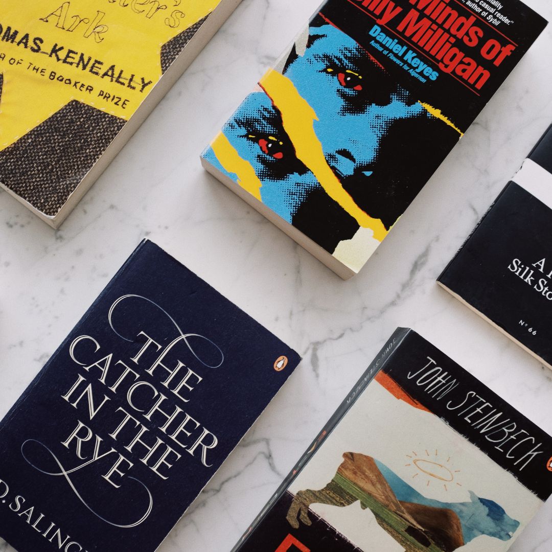
It’s important to gather inspiration from existing book covers when designing one. One great resource for this is the Book Cover Archive, which showcases covers from various genres. This archive can spark ideas for your cover’s imagery, color scheme, typography, and overall style.
Researching Trends in Your Genre
Researching trends in your genre is crucial for designing an effective book cover. It helps you understand what readers in your genre are accustomed to and what attracts their attention. By studying recent bestselling books in your genre, you can identify common elements and visual themes that resonate with readers.
When researching trends, consider the types of imagery, colors, and typography used on popular book covers. Look for patterns and consistencies across multiple covers. This will give you a sense of what works well within your genre and what readers expect to see when browsing for books.
Are there any common elements across many of them? For example, romance novels often feature bright colors and intimate couples. Literary fiction may use more subtle, text-focused designs. Studying examples from your genre helps ensure your cover visually fits readers’ expectations.
The Balance Between Originality and Conformity in Cover Design
Finding the right balance between originality and conformity is key in book cover design. On the one hand, you want your cover to stand out and be unique, catching the eye of potential readers. On the other hand, you also want it to fit within your genre’s expectations and norms to resonate with your target audience.
To achieve this balance, it’s important to understand your genre and its conventions. Study the covers of successful books in your genre and analyze the elements that make them effective. Look for common themes, colors, typography, and imagery prevalent in your genre. This will help you identify the key visual elements that readers expect to see.
Once you understand these genre norms, you can start brainstorming ways to add your own twist. Look for opportunities to inject your creativity and personality into the design. This could be through unique color choices, unconventional typography, or unexpected imagery.
By incorporating these original elements while adhering to your genre’s overall stylistic approach, you can create a cover that stands out from the crowd while still attracting your target audience.
It can also be helpful to seek feedback from others during the design process. Show your cover designs to beta readers, fellow authors, or design professionals to get their input. They can provide valuable perspectives and help ensure your cover balances originality and conformity.
2. Understanding the Essence of Your Book
The relation between the book’s main themes and the cover design is crucial. The cover should visually compellingly reflect the book’s core ideas, emotions, and style.
For fiction, this often means depicting a key character, location, or moment that encapsulates the essence of the story. For non-fiction, the cover may focus on the central concept or a powerful image that conveys the tone and message of the book. In both cases, readers will make snap judgments about a book based on its cover, so it must align with the contents.
The importance of the title and author’s name on the cover cannot be overstated. They must be prominent, readable, and effectively integrated into the overall design. The title is the main selling point and should immediately grab attention. The author’s name signals credibility and helps readers find books by authors they love. An eye-catching title and clear author name make a powerful first impression.
The role of optional elements such as subtitles, photos, background images, or graphics depends on the book.
Subtitles can clarify or expand on the main title. Photos of the author, relevant people/places, or symbolic images help tell the story. Background textures or graphics can set the tone and genre. The key is choosing optional elements that enhance the cover without cluttering or distracting from the core focus – the title and author name.
3. Visual Hierarchy and De-cluttering
An effective book cover should draw the reader to the most important elements, like the title and author’s name. This is achieved through strong visual hierarchy. Strategic use of color, size, placement, and contrast can direct focus and create an intuitive flow for the viewer’s gaze.
The title should be prominent and in a bold font substantially larger than the rest of the text. Placing it near the top captures attention. The author’s name is secondary, so it should be smaller but still clearly legible. Less critical elements like taglines and imagery should fade into the background.
Equally important is decluttering unnecessary elements. Too many competing fonts, colors, or graphics overwhelm the viewer, making the cover noisy and confusing rather than eye-catching. Eliminate any visuals that don’t strongly support the book’s theme.
Legibility must also be considered, especially for thumbnail versions displayed online. Cover text should be in high contrast with the background, and intricate fonts should be avoided. Pay attention to how images or textures may interfere with legibility when scaled down.
Key Takeaways
- Use a strong visual hierarchy to direct focus.
- Declutter unnecessary elements for a clean look.
- Ensure legibility, particularly in thumbnails.
4. Selecting the Right Fonts and Colors
Choosing the right fonts and colors is crucial when designing a book cover. The font and color palette help convey the tone and genre of the book while ensuring the cover is visually appealing and readable.
Guidelines for Using Fonts on Book Covers
Font selection impacts readability and helps communicate genre. For fiction, decorative script fonts denote romance, while a bold sans serif font may convey mystery or thriller.
Clean serif fonts like Times New Roman promote an authoritative tone for nonfiction. Fonts should be legible, especially the book title and author name. Avoid overly elaborate scripts. Use a maximum of two complementary fonts.
The Role of Color in Communicating Theme
Colors evoke emotions and meaning that can reinforce your book’s theme. Warm tones like red, orange, and yellow convey energy, passion, and intensity. Blue, green, and purple tones suggest tranquility, nature, and spirituality. Bright, saturated colors denote youthfulness and vibrancy. Muted, earthy tones promote sophistication. Select 1-3 colors that align with your book’s tone.
Impact of Color and Font on Legibility
Strive for high contrast between the font and background colors. Black or white fonts tend to be the most legible. Avoid busy backgrounds that could obscure the title and author name. Likewise, colored fonts can reduce legibility by having an insufficient contrast with the background. Prioritize the legibility of key cover elements like the title and author name when selecting fonts and colors.
In summary, font and color choices directly impact the effectiveness of a book cover design. Carefully select complementary fonts and a color palette that enhances readability while underscoring the book’s themes and tone. These subtle design decisions make a striking first impression on potential readers.
5. Considering the Back Cover and Spine
The back cover of a book serves several important functions in supplementing the front cover design. It allows space for a more detailed plot summary to intrigue readers.
The back cover also presents an opportunity to include endorsements from well-known authors, reviewers, or publications to build credibility. Finally, it provides room for author bios and photos to connect readers with the author.
When designing the back cover, maintain visual consistency with colors, fonts, and graphic elements used on the front. This creates cohesion across the entire cover. For example, if you used an artistic border on the front, continue it around the back. If certain colors are part of your theme, incorporate them into the back cover.
The spine is the narrow side of the book connecting the front and back covers. It displays essential information like the book title, author name, and publisher logo. A compelling spine design entices people to pull your book off the shelf. When designing the spine, choose a legible font size that considers the book’s thickness. Align text to the bottom for books that sit vertically or the side for ones displayed horizontally.
Here are some key tips for an effective spine design:
- Make the title and author name prominent.
- Incorporate graphics or colors from the front cover.
- Include the publisher’s logo.
- Choose an appropriate font size based on book thickness.
- Allow adequate spacing between text elements.
Maintaining visual consistency across the front cover, back cover, and spine creates a cohesive look. When designed effectively, these elements draw readers in and convey the book’s essence.
6. Case Studies of Effective Book Cover Designs
Examining real-world examples of successful book cover designs can provide valuable insights into creating an effective cover for your book. Here are four case studies analyzing book covers that skillfully communicate the essence of their respective stories:
The Great Gatsby by F. Scott Fitzgerald
The iconic cover art for F. Scott Fitzgerald’s The Great Gatsby features a disembodied female face on a blue background. This simple yet evocative image captures the elegance and mystique of the Jazz Age depicted in the novel.

The piercing eyes and red lips hint at the story’s themes of idealism, romance, and tragedy. The art deco-inspired illustration matches the novel’s 1920s setting.
The Handmaid’s Tale by Margaret Atwood
The Handmaid’s Tale employs high-contrast red and white to convey oppression and female subjugation. The white wings framing the face create a visual metaphor for the handmaids’ role as captive angels in an authoritarian regime. The red veil symbolizes their status as property of the state.

This striking cover immediately communicates the dystopian premise of Atwood’s novel.
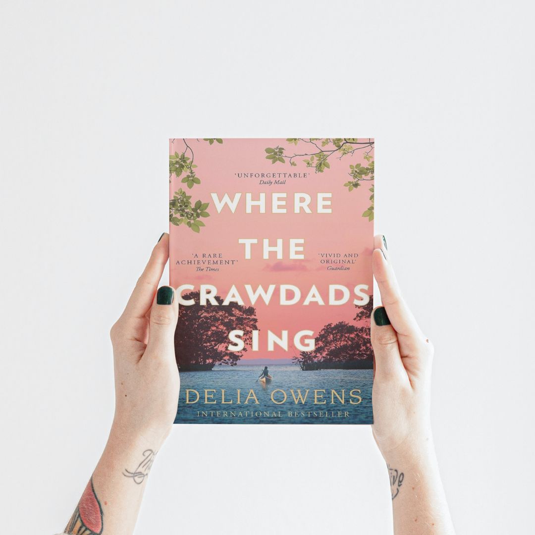
Where the Crawdads Sing by Delia Owens
The cover of Where the Crawdads Sing features a girl in a marsh surrounded by birds and natural imagery. This pastoral scene immerses readers in the novel’s coastal North Carolina setting. The visual focus on the young protagonist hints at her isolation and independence living alone in the marsh. The cover evokes the coming-of-age story’s nature, resilience, and solitude themes.
Studying these and other compelling book covers provides takeaways to apply to your design process. Connect imagery and color choices directly to your book’s themes and contents. Prioritize visuals of key characters, settings, and plot points. Most importantly, ensure your cover instantly conveys the heart of your story to hook readers.
Conclusion
Designing a book cover requires skill, experience, and access to high-quality design tools. While it may be tempting to try designing your cover, especially if you’re on a tight budget, hiring a professional designer is usually worth the investment.
The Benefits of Hiring a Professional Book Cover Designer
Professional designers have years of experience designing eye-catching, genre-appropriate covers. They are familiar with the latest trends in cover design and know what sells books in your genre. A great designer can make your book stand out on crowded virtual and physical shelves.
Designers can also access premium design software and resources like quality stock imagery. This allows them to create covers with polished typography, compelling graphics, and a cohesive look and feel. Doing this yourself with limited tools is extremely challenging.
In addition, designers provide an objective outside perspective. They can look at your book with fresh eyes and come up with creative design ideas you may never have thought of. Their feedback and suggestions are invaluable for making your cover appeal to readers.
The Challenges of Designing Your Cover
While DIY book covers have become more common, they often look unprofessional. It’s remarkably difficult for amateurs to design covers that adhere to genre conventions and meet industry standards. Well-intentioned attempts often result in covers that are cluttered, typographically weak, or mismatched to the book’s content.
Creating your cover requires significant time and effort to learn design principles and master software. This can detract heavily from the time needed to write and edit your book. And if sales suffer due to a poor cover, redesigning later nullifies all that effort.
Hiring a pro upfront can save time, frustration, and money in the long run. It’s a smart investment that gives your book the best chance of success.
Carefully Consider Your Design Process
In conclusion, don’t underestimate the importance of your book’s cover design. Take the time to research designers, provide them with details about your book, and give thoughtful, creative direction. Be open to feedback throughout the process. Investing in a professional cover is the single best thing you can do to make your book irresistible to readers.
6 thoughts on “Designing a Book Cover: 6 Key Considerations”